Resources


01
Community
Stark (Slack Channel) → Accessibility tool with a practical community conversation around designing for accessibility
Readability Consortium → leading research on improving the written word
Health Design Lab → A bunch of good people at Emily Carr U. doing great work
Fonts In Use → The best, no introduction needed
02
Tools
Coldtype → 3D type and animation tools for Blender and Drawbot by Rob Stenson
Glyphs App → font design software that lends precision to logo and icon design
Accessible Perceptual Contrast Algorithm → a good read on colour accessibility
QGIS → Open source GIS (mapping) software

03
Mockups
I make mockups in Blender and put together a few trick tips here. It's a great intro to 3D project that can escalate quickly in case you eventually want to learn to do animation, motion design, film titles, video games, or vfx.
① References
Make a plan. Look at good mockups and light. Couple places to start: Nano Raptor, Soft Electronics, Present & Correct, WhereIWouldLikeToRead.
② Blender Set Up
I use this start up file for most projects. It keeps tools organized and includes shortcuts, settings and assets that work well for my designer brain. Tweak it to work better for you. Feel free to use it as your default if you'd like: file > default > save start up file. Bonus: follow this tutorial to set up a camera rig.
③ Modelling
Start with a phone, tablet, or monitor. They're just cubes with selectively bevelled edges and inset screens. The first 30 seconds of this tutorial gets you 90% of the way there. If the bevel tool isn't working evenly, apply your transforms. If your transforms aren't working perfectly, set your origin to the centre of mass. To work non-destructively use the bevel modifier with vertex groups or weight painting. Optional: add volume buttons, charging ports, or stands. Multiply with the array modifier. Tip → Nothing in the real world has perfect 90 degree edges, there's always a little bit of e
Make a quick background and objects to cast shadows. This could be a flat plane for a desk. It could be the corner nook of your office. It could be a window or a super simple wall that casts shadow lines. It could be a manually modelled plant or a drapes using fabric physics. It could be an animated plant mimicking wind passing through leaves to add motion to your shadows. It could be an approximation of plants or a procedural node based simulation of clouds casting soft shadows. It could also be a free asset from something like BlenderKit. If you're just starting out with Blender, keep things really simple. Blender is near infinite.
More advanced → model a computer keyboard. Start with a button and duplicate it. Dive into the weeds of UV maps to add labels.
Really advanced → follow this geometry nodes tutorial to step into the deep end of procedural modelling with geometry nodes.
④ Materials
Start with Principled BSDF textures for everything. Click the plus button to add multiple materials to a single model. Select faces in edit mode and assign them to different materials. For metal: increase metallic + specular settings to near 1, and roughness to near 0.4. For glass: metallic + specular near 1, roughness near 0. Optional: set emission to the colour of your content in the node editor and emission strength to 2 (ish), transmission and alpha near 1. For background + architectural materials: run wild, you'll figure it out.
⑤ Lighting
Lighting levels of complexity:
1. Use 3 point lights to mimic a studio lighting set up.
2. Use an HDRI (essentially a 3D photo sphere) to get environmental reflections
3. Use the Sky Texture (essentially a simple sun simulation). I'm a big fan.
4. IES's and beyond
⑥ Rendering
Cycles is great. I render at 14 ish samples for the viewport, with denoising starting at 13 ish and adjust depending on how detailed I need previews. For full renders I use ballpark 250 ish for a still frame. Under the colour management tab use Filmic, medium high contrast.
⑦ Mockups
I finish my mockups in Adobe PS or AE because it gives more direct control over colour levels without colours being dependent on raytraced lighting. Bonus → figure out UV maps to place your content into the 3D scene and use the emission shader to cast light on reflective objects.
General References

05
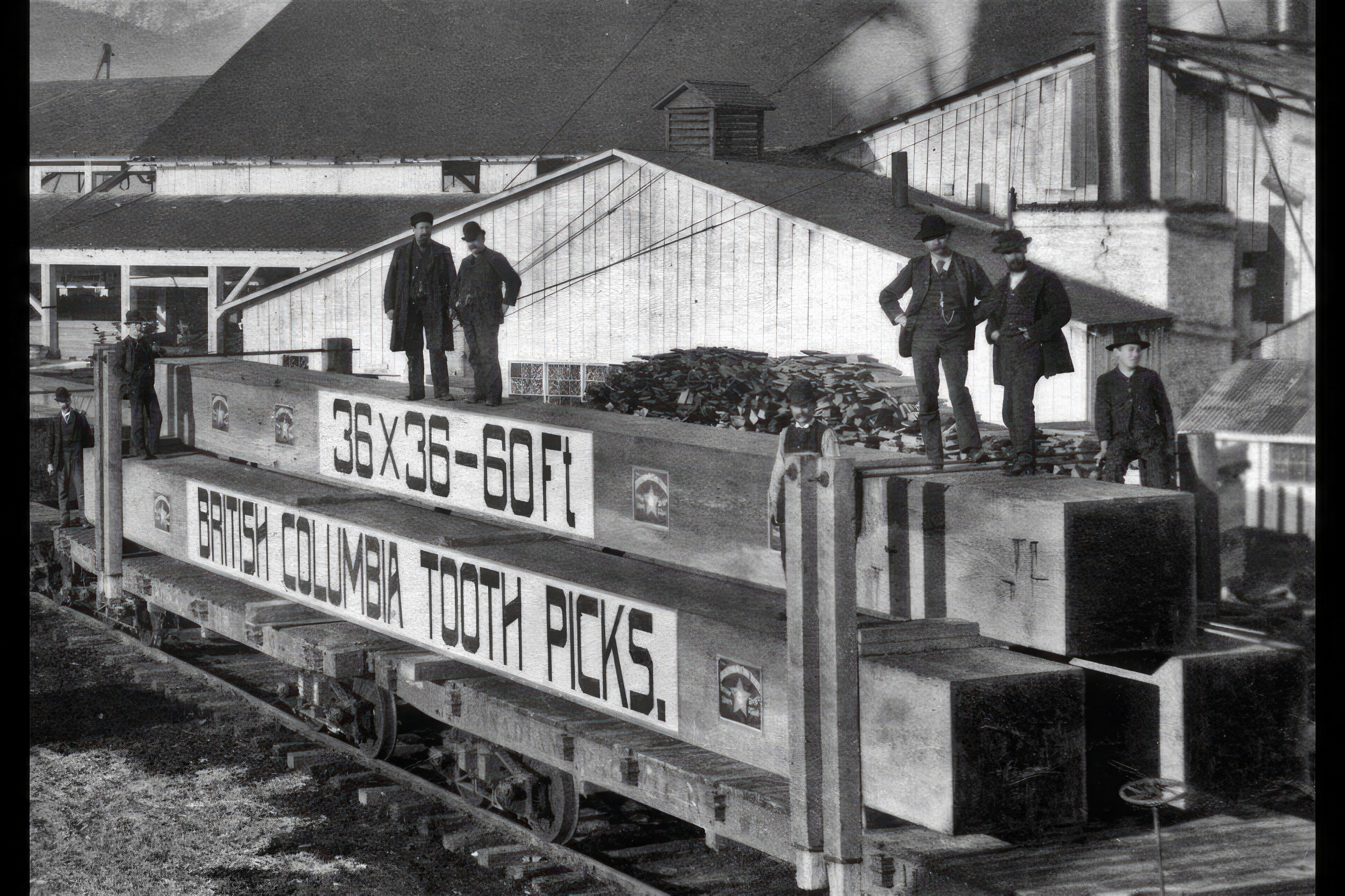
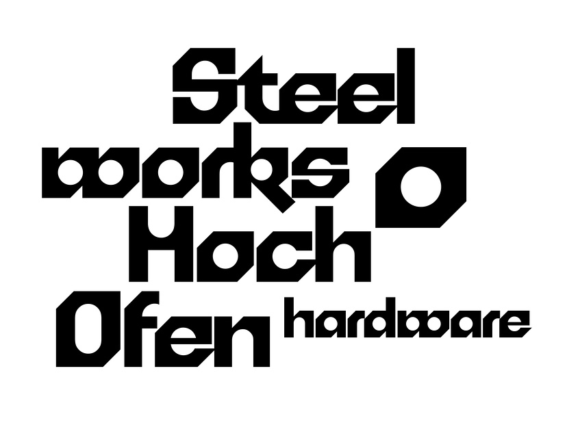
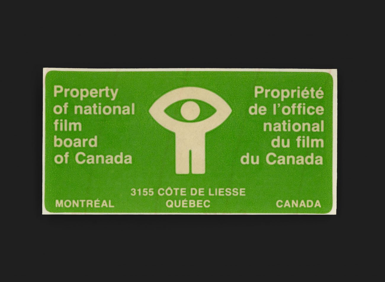
Design I love


Menu