Optical
Info
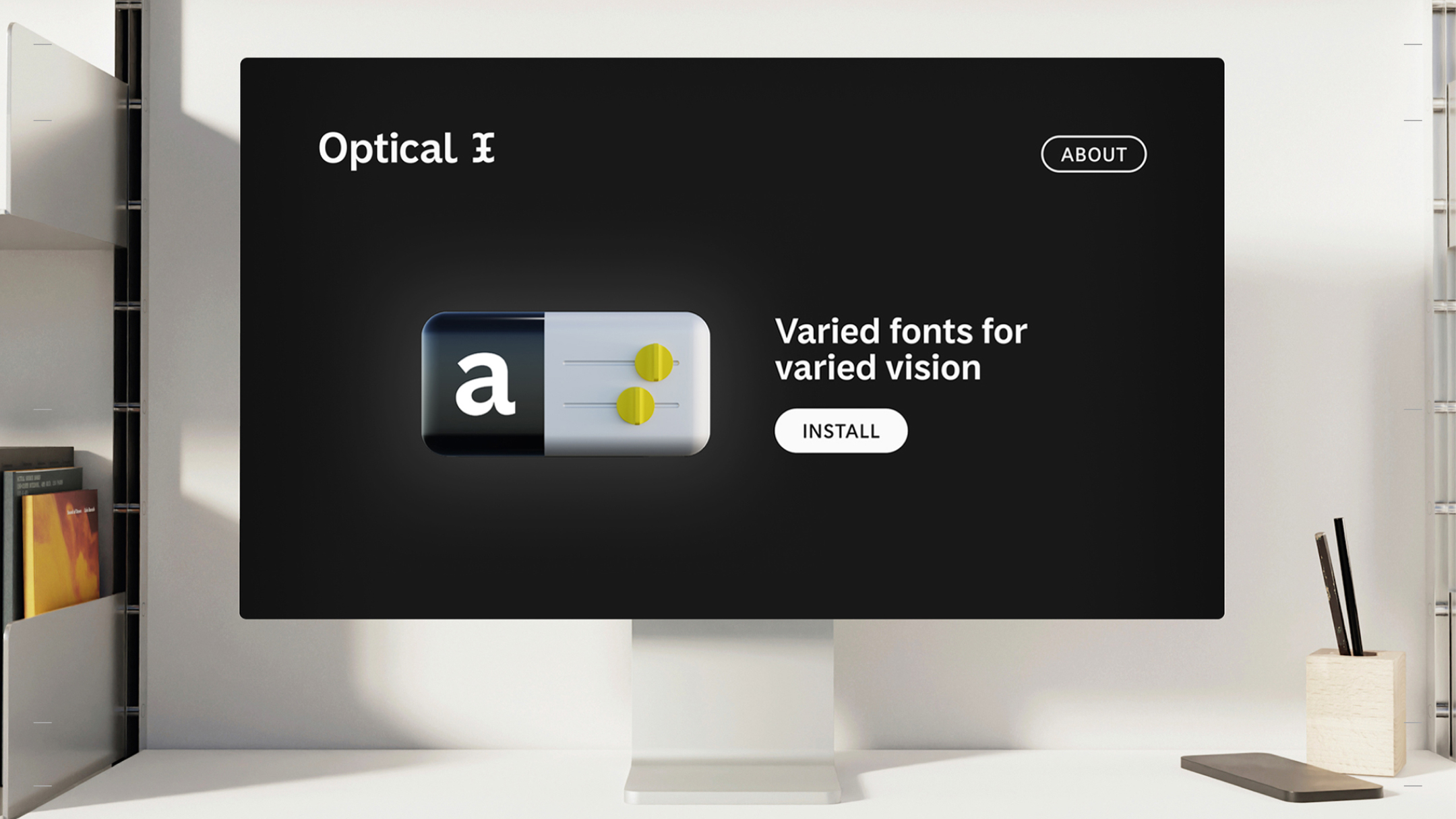
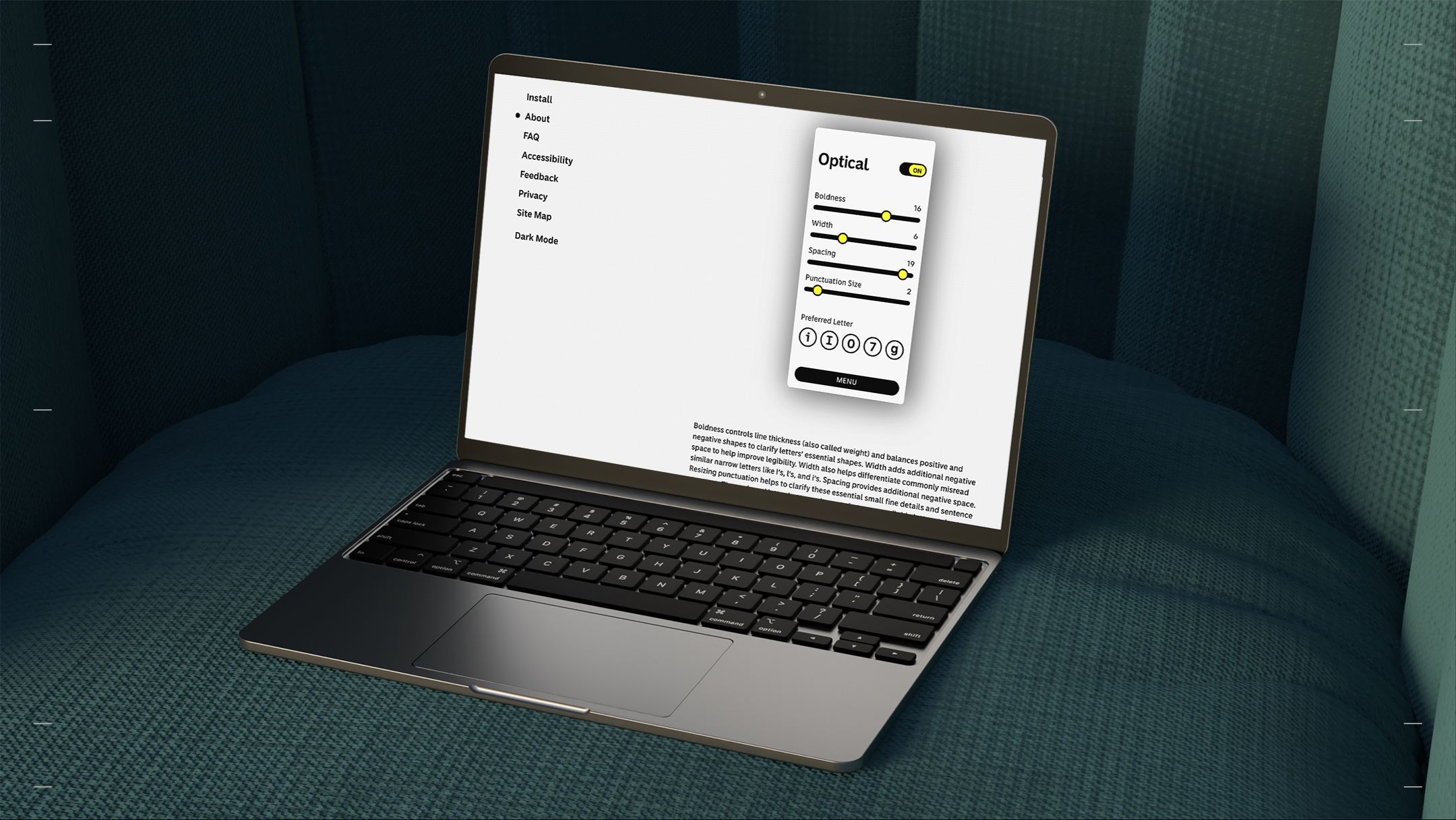
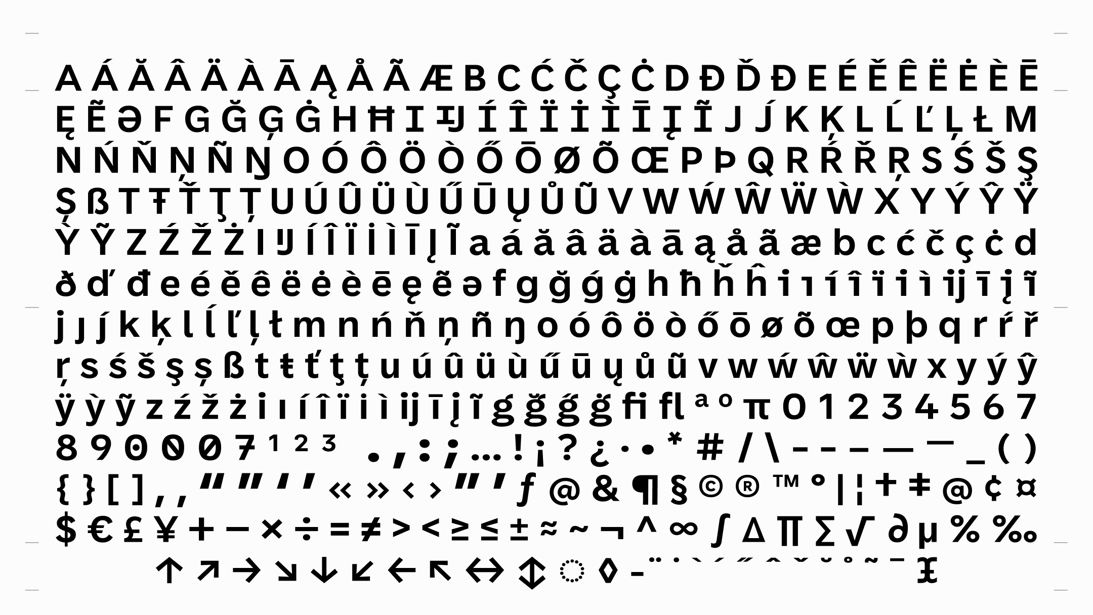
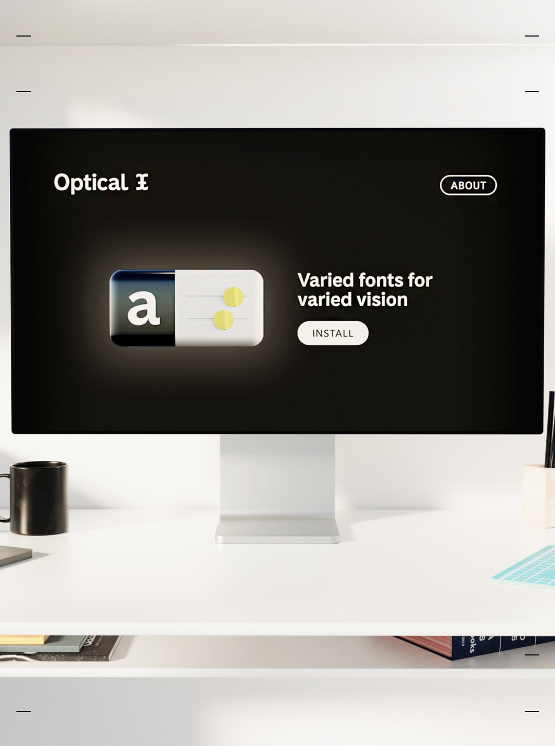
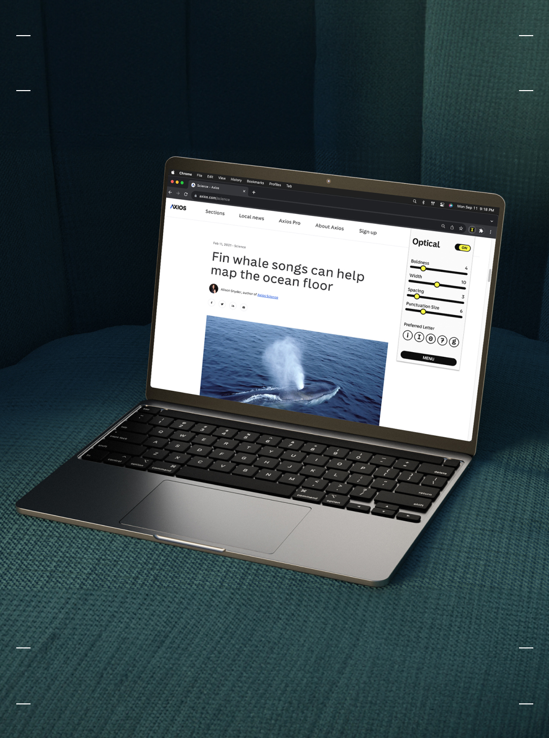
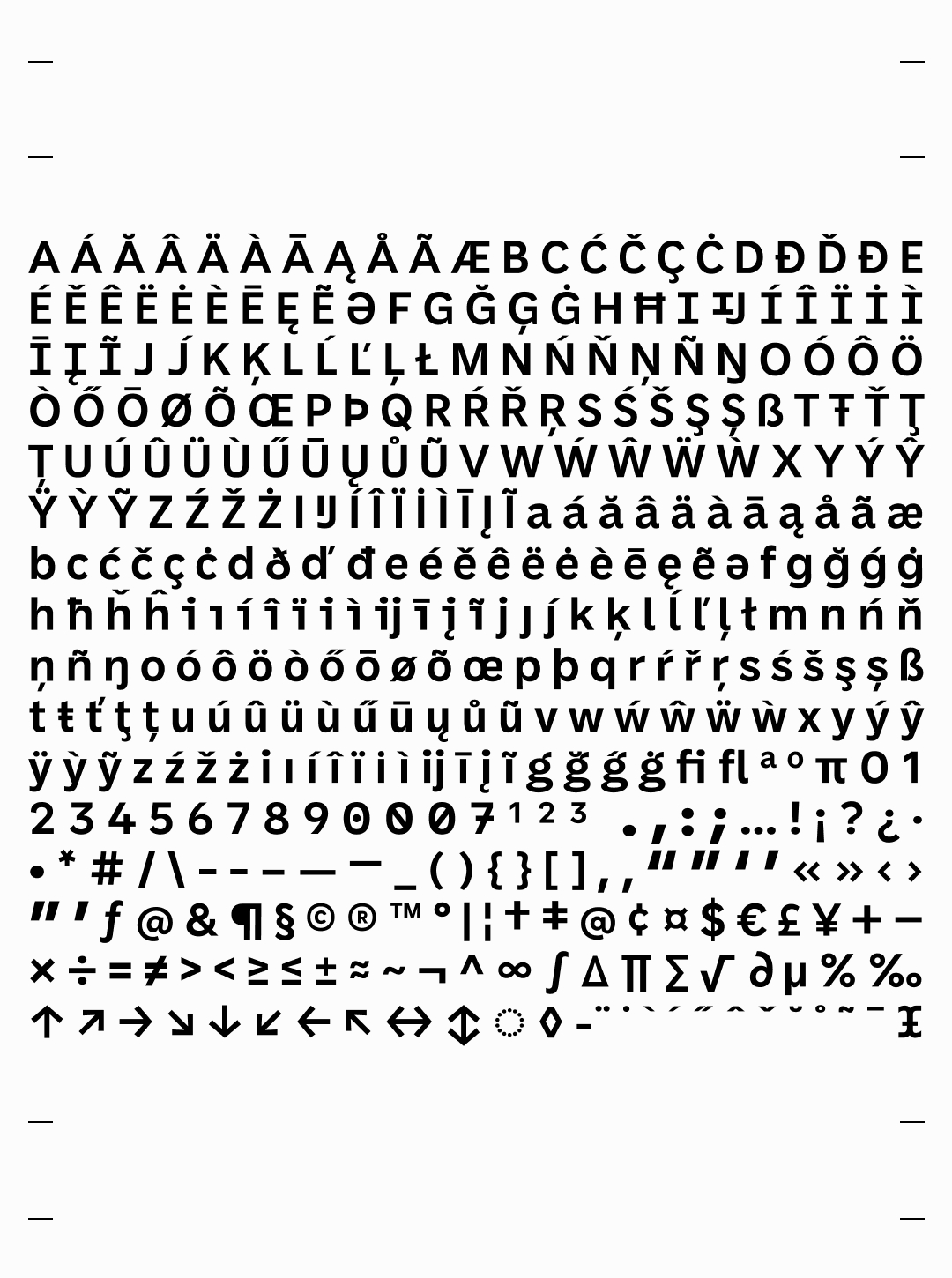
Optical is a font family and browser extension that tailors letters to varied low vision. Reading is not a trivial task. Two hundred and sixty million rods and cones in your eyes detect light and relay electrical signals to the language centres in your brain for identification and interpretation. We depend on the written word to stay informed, connected, and employed, but we haven’t perfected it. Our alphabet was created for paper, for the general population. It works well. It doesn’t work perfectly for everyone. Research suggests ways to improve letters for low vision. But low vision varies by source and degree. There are no one size fits all solutions in accessibility. Optical uses the variable font format to improve legibility for a broad range of vision.
Optical benefits from extensive testing with the low vision community and feedback from the type design and technology communities including Google Fonts and Accessibility, the Advanced Reading Technologies team at Microsoft, and the Readability Consortium, among others. I started and lead the project and am responsible for research, direction, identity, web, and some type design. Version one is the result of a collaboration between the Accessible Technology Program of Innovation, Science, and Economic Development Canada, the Health Design Lab and the Shumka Centre at Emily Carr University, the Disability Alliance of British Columbia, Liiift Studio, and Abyss Type company. We're currently seeking partners for further development: a coding application, expanded language support and continued research.
PROCESS
Team
Tyler Hawkins Research, Direction, Design, Founder
Mirko Velimirovic Type Design, Mastering
Quinn Keaveney, Colby May, & George Mcrae, Liiift, Web and Extension Development
Accessible Technology Program
Innovation Science and Economic Development Canada
Disability Alliance of British Columbia
Emily Carr University
Health Design Lab
Shumka Centre
With feedback from
Low vision community of British Columbia
Advanced Reading Technologies team at Microsoft
The Readability Consortium
Type and Accessibility designers at Google
Sofie Beier, Centre for Visibility Design RDA
Dr. Peter Renke, Optometrist
Thomas Jockin, Lexend
Stephen Nixon, Arrow Type